
WorldShares
Challenge
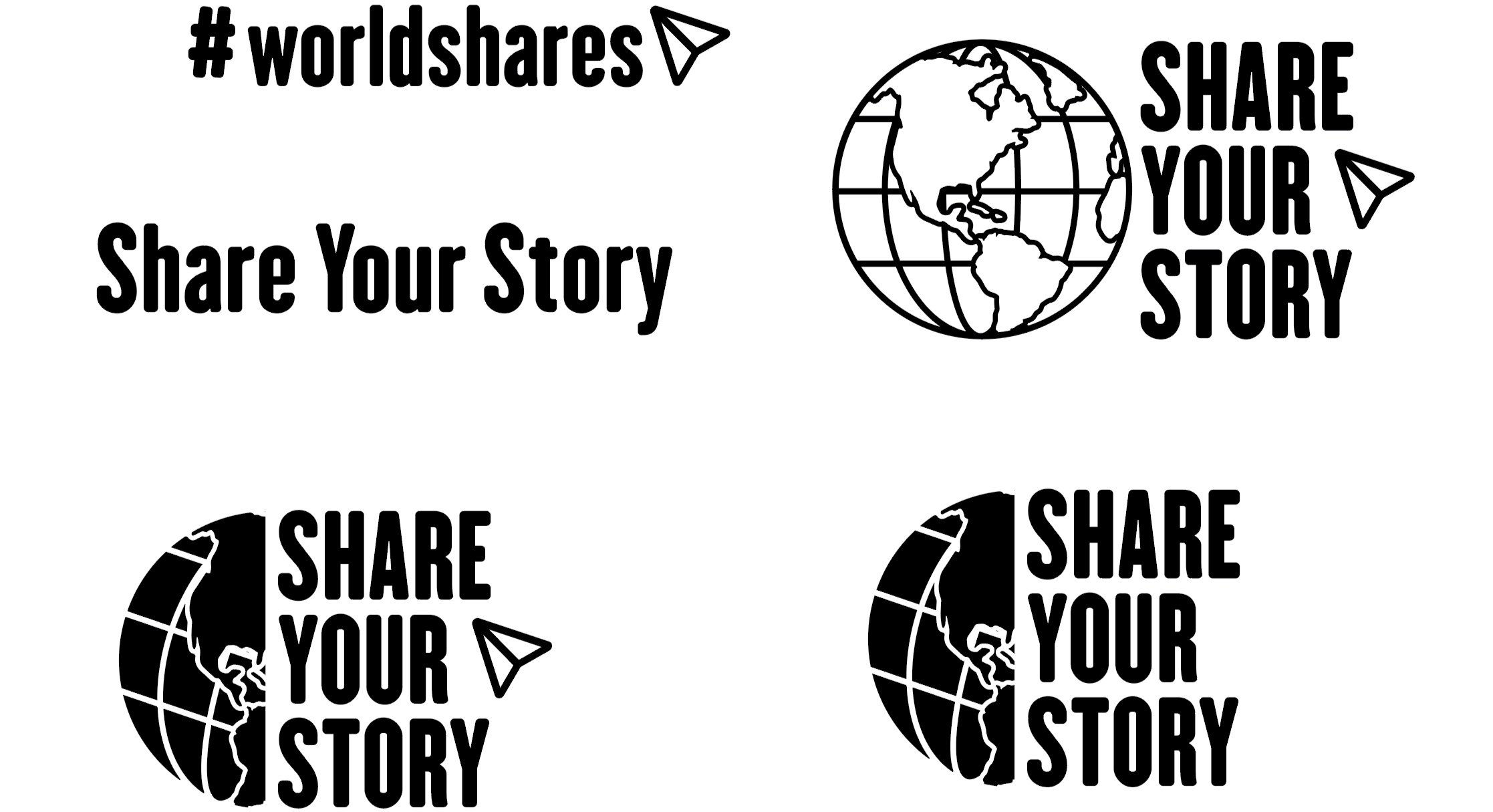
Design full branding for WorldShares including logos to be used for garments & accessories all in one color for easy printing. Requested elements was to include the globe, the “share” icon, and the phrase “Share Your Story”.
What is WorldShares
At a glance it’s a social media account on instagram focusing on nature photography with shared and reposted photos from many photographers around the world. However, there is a greater purpose for this small company on instagram. It’s a community built to give everyone the opportunity to showcase self expression and what they believe in through photography. It highlights how beautiful the world is and why we need to take care of it and how close we all can be to each other, even if we are actually across the world from one another. Worldshares holds what the people all have in common; an artist eye, compassion, a story, and much more. It’s a perfect example of how supportive and powerful a community can be when they come together for the same purpose.
Digital Drafts
I started with creating multiple versions of the globe and went with incorporating the “share” icon which ties into the “Share Your Story” idea. I went back and forth with two typefaces that were working well and created multiple outcomes for being the potential final designs. Having multiple check ups with the creator of WorldShares and discussing what we liked and didn’t like, the options were narrowed down.


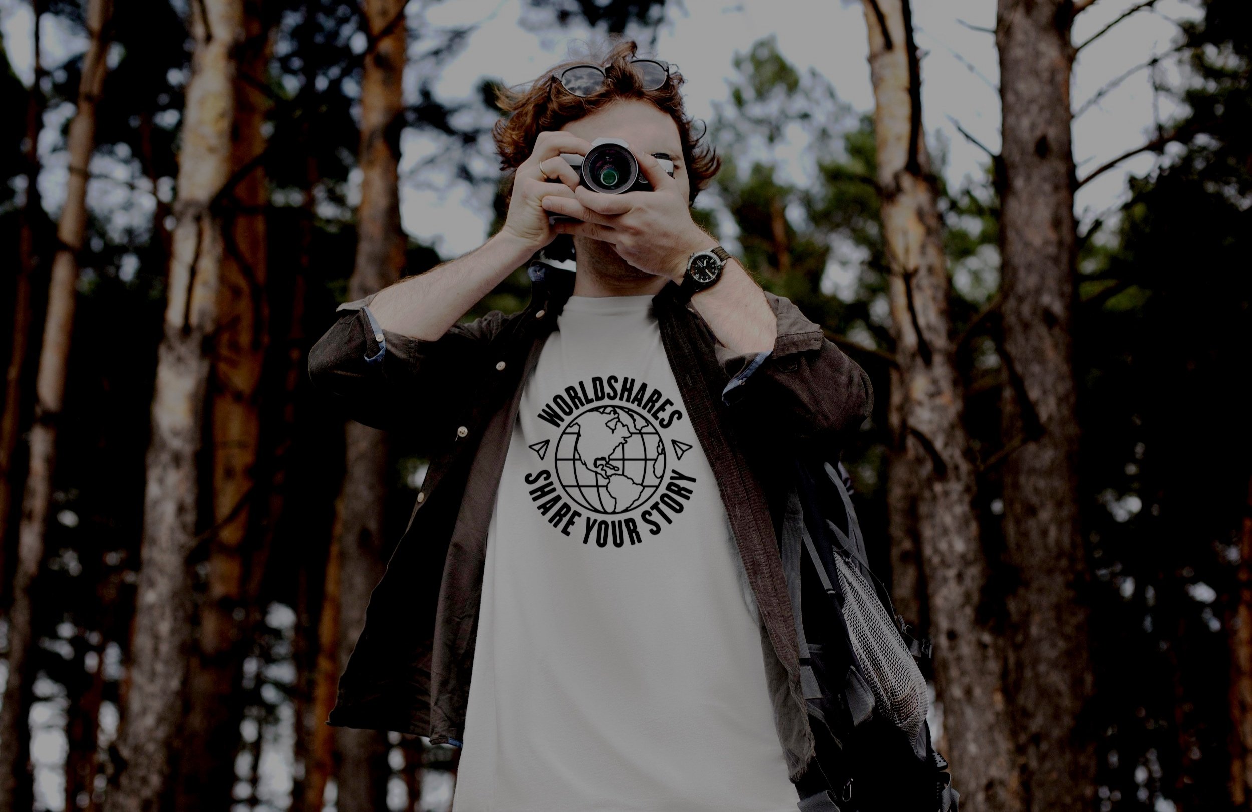
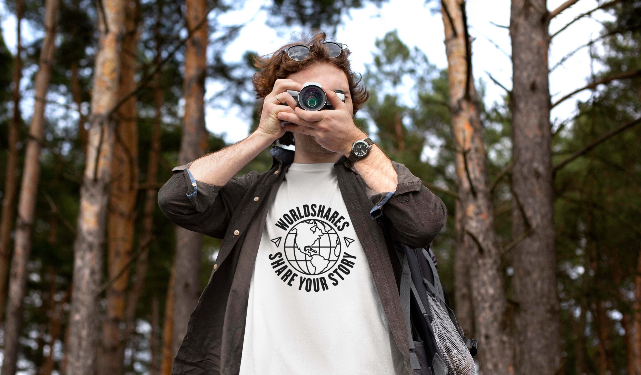
Solution
There were some last revisions to get to the finalized designs. First was for the shirt graphic, it originally had WorldShares repeating around the globe. I thought instead of having it repeat, it could be the perfect place to include the phrase “Share Your Story” underneath the globe. To give the design a more completed and symmetrical look, I decided to include the share icon on either side and separate the two texts.
Second design that’s on the umbrella showcases crop marks to represent the photography aspect of WorldShares. Instead of having the full name, I abbreviated it to “WS” for a simple, clean look.
The third design on the journal included a different typeface in the original, which gave too much of a sharp, edgy look. To fix this, I switched to the chosen typeface giving it a softer and more modern look while keeping a well balanced boldness


Reflection
Completing this project I was reminded you can design strong, memorable logos and graphics using just one color. These final designs didn’t need multiple colors to be effective in conveying the WorldShares message.
If you would like to be apart of this community and what they stand for, give them a follow on instagram at WorldShares.