Team Target
Challenge
Designing Target team member merchandise, showing that we are a team who values hard work, partnership, and unity. Must also include the target store number somewhere on the design.
Exploration
Since the goal was to show we are a team, I took inspiration from university lettering and letterman jackets. I sketched out a few concepts for the front which will be a single “T” and the back with full text. I also sketched out some additional merchandise to help spread the team spirit.
Solution
Using a university typeface, I wanted to keep the front simple and straightforward so I paired the target bullseye resting next to the letter “T”. On the back I had “Target” stretched across on a curved axis, giving that iconic letterman jacket look. With the other elements, I placed it under the text fitting nicely in the curved space. Then had a filled in shape behind the store number to give it emphasis.
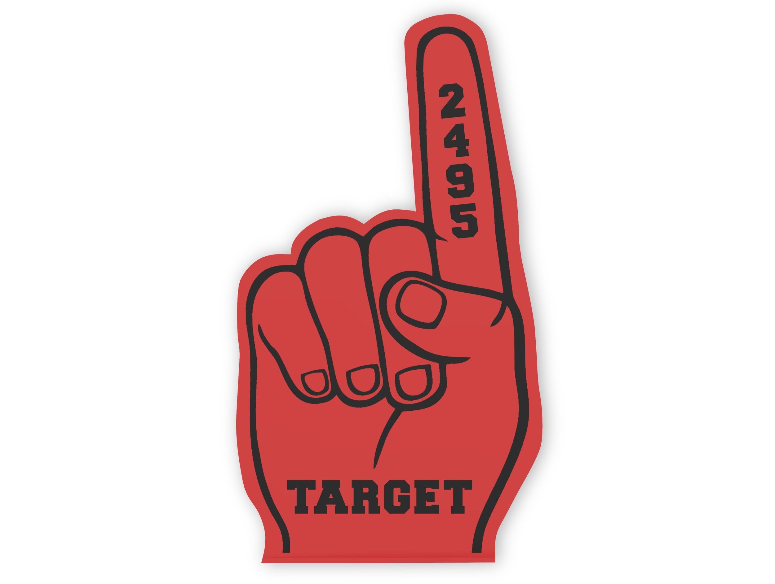
I also wanted to include fun fan gear to really bring that team spirit. So designing a foam finger and team flag displays that perfectly.
Other accessories I incorporated was a planner to stay organized alongside a drawstring bag to keep your personal items together to be ready for the workday.
Reflection
I learned that design and branding can be essential for a company to portray being a part of a team. Being part of a team is showing you’re proud of your team’s work ethic and skill sets as well as displaying it through shared merchandise. That is what gives you extra motivation to work your hardest and show team spirit, while looking your best.


